
A pool float at a resort launch event or drifting through a social media feed can trigger instant brand recognition before anyone reads a single word. That’s no accident. The brands getting the most mileage from custom pool floats have cracked the code on which design choices turn a vinyl inflatable into a walking (or floating) billboard. You’ve probably seen floats that get photographed and shared thousands of times, while others sit forgotten in a pile. The difference? Design. This article walks through the specific visual and structural elements that make custom pool floats instantly recognizable as part of a brand, so you can apply those same principles to your own promotional strategy.
Color, Shape, and Logo Placement: The Foundation of Brand Recognition
Here’s the thing: strong brand recognition on a pool float starts before anyone even picks it up. Pool floats are three-dimensional shapes, which is part of what makes them different from flat print media. Custom-designed pool floats are one example of how brands are using that shape. How a design uses that shape decides whether someone connects it to the brand in a few seconds or misses it completely.
Color is usually the first signal. Research from the Pantone Color Institute shows that color alone accounts for up to 80% of brand recognition. That means your exact brand hex codes need to transfer accurately onto the float’s surface material, not approximate shades that look close enough on screen. UV-resistant inks and material coatings matter here because pool environments expose color to intense sunlight, chlorine, and humidity. A float that fades after two seasons sends its own message. And not a flattering one.
Why Logo Placement Determines Visibility in Real-World Conditions
Logo placement on a pool float is genuinely different from placement on flat printed surfaces. Floats move, tilt, get partially submerged, and rotate in the water. The standard upper-left corner placement that works on a brochure spends half its time face-down or pointing at the sky. The most effective logo placements account for how the object naturally sits in water; for a raft-style float, the top center panel stays visible both to the person lying on it and to anyone watching from poolside or a second-floor balcony. Three-dimensional character floats or shaped inflatables benefit from brand logos on the side panels, where they read clearly in photos even when the float gets surrounded by people. Think about the typical photo angle your audience will use, then place the logo where it lands in frame.
How Brand Colors Translate from Screen to Inflatable Material
The material surface of a pool float doesn’t behave like paper. Vinyl and PVC inflatables have a slight sheen that shifts how colors appear in direct sunlight versus shade. Bright, saturated colors tend to perform better than muted tones because their reflectivity can wash out pastels and neutrals. If your brand palette relies on softer tones, a skilled manufacturer can compensate with slightly deeper base pigments so the final product reads accurately under outdoor light. You’ll notice physical samples matter here; a color that looks perfect in a digital mockup can read differently on a glossy curved surface. The print method also matters. Screen printing, digital printing, and heat transfer each interact with inflatable materials differently; each has its own ceiling for color accuracy and detail resolution.
Shape as a Brand Signal: Why Float Design Goes Beyond the Logo
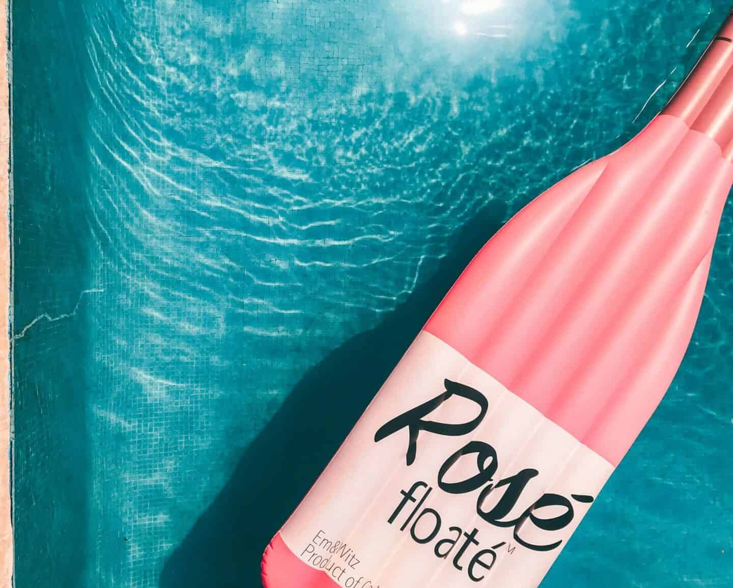
So color and logo placement carry a lot of weight, but shape is where branded pool floats truly separate themselves. Shape is what your audience identifies from a distance, in a blurry social media photo, or in a quick video frame before they can read any text. Some of the most memorable branded floats owe their recall entirely to shape. A float shaped exactly like your brand’s signature product (a salad bag, a fan, a water bottle, a soup bowl) creates an immediate visual shortcut that bypasses the need for a logo. The shape becomes the brand signal itself. This works best for brands with a distinctive product silhouette; even brands without a single hero product can develop shape language tied to a mascot, icon, or brand character. What matters most is specificity. A vaguely round float doesn’t communicate anything; a carefully engineered silhouette tells a story.
Translating a Product Silhouette Into an Inflatable Form
Turning a real product’s silhouette into a structurally sound inflatable requires compromise, but the best results stay faithful to the source shape while accommodating the physics of air-filled vinyl. Sharp corners become slightly rounded; thin protruding elements get thickened for structural integrity; complex surface textures get simplified into bold graphic treatments on flat panels. The goal is to preserve the immediately recognizable outline while producing something that holds air reliably, floats correctly, and survives actual pool use. Brands commissioning their first shaped inflatable usually get better results by starting with the most iconic and simplified version of the product silhouette rather than trying to replicate every detail. Think of it the way a skilled illustrator approaches logo reduction: strip back to the elements that communicate identity fastest, and let those carry the design.
Using Mascots and Characters to Create Float Personalities
Not every brand owns a product with a photogenic silhouette, but many have a mascot, character, or recurring visual motif that can anchor a float design. A brand mascot translated into a float character creates something with genuine personality; viewers respond the way they’d respond to a costume character, with warmth and immediate identification. Character floats also perform well in user-generated content because people want photos next to something with a face and personality, not just a flat panel with a logo. For this to work, the mascot’s proportions need to be adapted for an inflatable form factor, which typically means enlarging the head relative to the body for visual impact and stability. The character should be immediately identifiable from any angle, since floats rotate and no single viewing angle is guaranteed.
Conclusion
The design elements that make a custom pool float instantly recognizable as part of a brand boil down to three interconnected choices: color accuracy, strategic logo placement, and a shape or character that communicates identity without requiring the viewer to read anything. Each element reinforces the others. A float with perfect color but a generic shape still blends into the background; a bold shape with misplaced branding misses the photo opportunity entirely. Brands that get all three right produce promotional products that generate organic exposure well beyond the original event or giveaway. If you’re planning a branded float for a campaign, start with the single most recognizable visual element your brand already owns, and let the float design improve it. Get these elements right, and you’ve built something worth sharing.